Meet the SafeSwim Logo: Our Visual Identity
Blog post description.
2/15/20261 min read
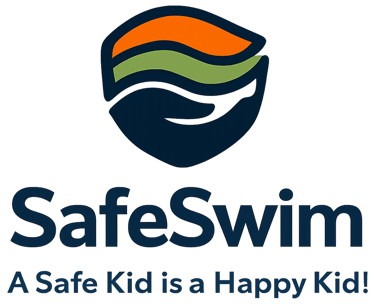
Every project needs a face — and we are excited to reveal ours. The SafeSwim project now has its official logo and visual identity, adopted by all consortium partners and used across our materials, communications, and publications.
The idea behind the design
Our logo brings together the two ideas at the heart of the project: protection and joy. At its centre is a child figure, lifted and supported by a pair of open, caring hands — a direct visual expression of safeguarding: adults creating a safe space in which children can thrive.
It reflects our tagline perfectly:
A Safe Kid is a Happy Kid!
The colours
Blue — water and swimming, but also trust, calm, and safety
Orange — warmth, care, and the energy of children at play
Green — growth, well-being, and a healthy environment
Together they create a friendly, optimistic mark that speaks to coaches, parents, and young athletes alike.
More than a logo
The SafeSwim identity is part of our commitment to visibility and quality. You will see it on our workshops, certificates, presentations, and online channels — a consistent reminder that, in sport, the safety and well-being of every child comes first.
This project is co-funded by the European Union. Views and opinions expressed are those of the author(s) only and do not necessarily reflect those of the European Union or the European Education and Culture Executive Agency (EACEA). Neither the European Union nor EACEA can be held responsible for them.